
Typography and Poster Art
Toulouse Lautrec created some of the most recognizable posters of the late 1800's. His whimsical illustrative style captures the movement and energy of the lively shows in Paris featuring dance and music.
This makes him a great artist to study to introduce typography!
Being a graphic designer myself (with a focus on typographic design) I LOVE the idea of getting kids to think about the written word, and how it can integrate with art.
Invite your kids to look at a few of Toulouse Lautrec's posters, and create their own poster to promote a show. (They might even like to create and perform the show, too!)
Who was Toulouse Lautrec
Henri de Toulouse Lautrec was painter, illustrator, and printmaker in the Post Impressionist period of modern art. He was captivated by the theatre in Paris, especially the Moulin Rouge cabaret.
“I paint things as they are. I don’t comment. I record. ”
His art is instantly recognizable, as he created a style that was all his own. He was inspired by Japanese wood prints, and you can see that influence in his use of black outlines, black silhouettes, and fields of solid color.
In contrast to most painters, who were painting outdoors during the days and creating landscapes, Lautrec painted the nightlife indoors, capturing a fleeting moment in time, and the energy of the room.


Create your own poster
Invite your kids to create an imaginary show involving people or animals, and design a poster to promote it! Think about the typography and how to incorporate it as a part of the image (not just an afterthought added on top of a drawing). When designing their poster, invite kids to consider:
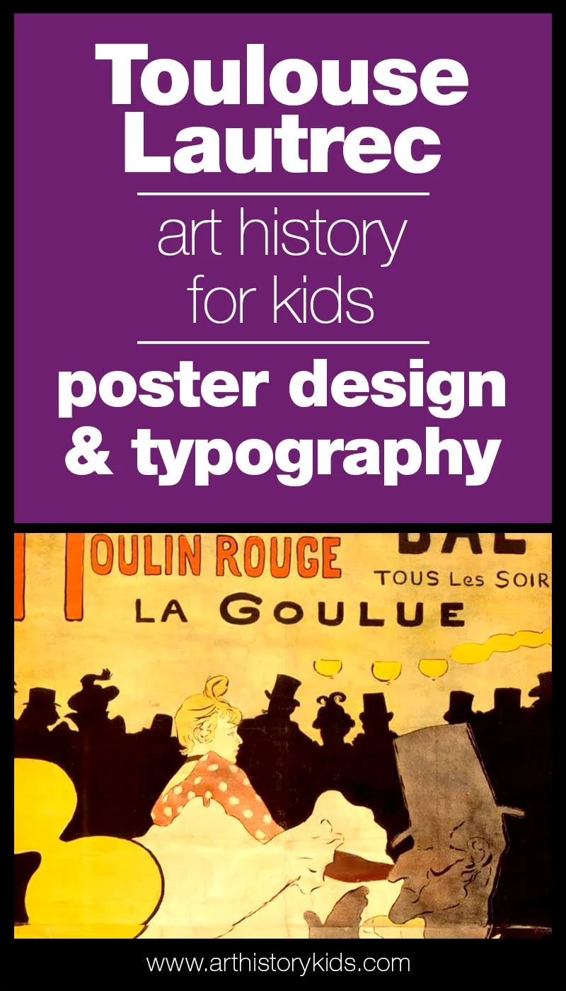
Composition: How will you organize all the elements? How will all the different images flow? Notice in the poster above, the dancer's leg leads your eye to the man's face. The man's hand leads your eye back up to the dancer. Lautrec designed the composition to guide the viewers eye in a circular motion around the page.
Contrast: How will you balance light and dark areas? Will you use silhouettes to show things in the far distance like the poster above?
Hierarchy: What is most important? How can you show that? Make it bigger? Darker? Center it on the page?
Line Quality: Look at the poster above and how the line gets thicker and thinner. See how it dances across the page, dropping off and then picking back up again. Sometimes it shows a definite outline or border, and sometimes it just hints at a shape. Think about line quality as you illustrate your poster.
Typography: What will your poster say? What kind of feeling will your typography have? Some type feels friendly, some feels strong, and other times it feels dreamy. What do you want your type to feel like, and how will you integrate it into the artwork?
Let's Connect
Did your kids like coming up with a show idea? Did they actually perform it for you!? Find me in the private Art History Kids Facebook Group, or leave a comment below and let's chat.